Everything about Web and Network Monitoring
Everything about Web and Network Monitoring
In the last installment of this series we introduced HTML5 as a major icon of the open web approach to mobile app development. Open standards, low barriers to entry, and cost savings are some of the many benefits that make HTML5 an appealing standard for many developers and enterprises alike. Let’s turn and focus now on specific HTML5 strategies that business leaders should adopt into their mobile app development arsenal.
Adopt HTML5 Standards for a Richer Web Experience
HTML5 includes a significant number of updates to the HTML syntax, language, APIs that provide a richer web experience and that allow for easier integration of multimedia, graphical, and geo-location features. Omitting the need for Flash and other 3rd party plugs (and saving costs!), the latest HTML5 update includes new media tags like <audio> and <video>. New structural tags help to organize the content better, leading to improved SEO. And the <canvas> element is one of several enhancements that offer improved graphics and visualization. HTML5 is also supported by a wide range and ever growing number of browsers. So for overall improvements in speed, appearance, performance, and SEO, the important first step in your Mobile adoption strategy is to update your web standards to HTML5.

Create a Mobile-First Responsive Web Design
As we’ve learned already, the HTML5 vs. Native argument is a dead-end. Instead of haggling over whether Native or HTML5 is the best approach, mobile strategists should spend their time planning and designing a premier user experience that ensures repeat traffic and client satisfaction. The needs of the customer are central because they are ultimately the ones who will be using your application (or not!).

In order to retain competitive rankings and an advantage in the marketplace, the business leader must ensure that the organization’s web content is accessible on any mobile device. The first strategic action here is to adopt Responsive Web Design (RWD). Mobility has changed customer expectations and the experience they’ve come to expect. RWD meets this need by providing a more optimal viewing experience across the growing landscape of mobile device types and screen-types.
A responsive web design is accomplished by crafting one HTML page with multiple sets of CSS styles and then using media queries to target each set of styles. For example,
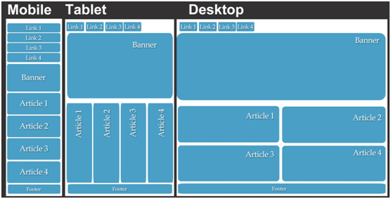
By setting up your web content in RWD format and making it accessible on smartphones and tablets, you’ll be taking deliberate steps to ensure that consumers visiting your website have a seamless experience across each type of mobile device.
In the next part of this series we look at the Native approach, the advantages of this framework, and why it’s often considered the overall best in class framework for mobile app development.


