by Ali Gajani
| May 17, 2013

Live Demo | Source Code
In Part 1 of this mini-series, we introduced you to Blueprint CSS, a highly popular CSS framework with a minimal footprint. Today, we are going to take things a step further and show you the true power of Blueprint CSS by creating a fully functional home template.
Here’s what we are going to build today, but there are a few requirements:
- 30 minutes of your time
- Have read the previous tutorial on Blueprint CSS (Part 1)
- Working knowledge of HTML and CSS
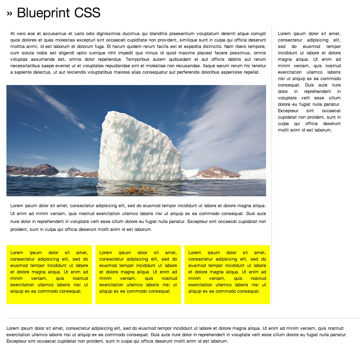
As you can see in the image above, there are multiple components to this home page template. We are going to break down each of the components for ease of explanation:
- Header
- Sidebar
- Main Content
- Sub Content
- Footer
Note: Every code shown below is wrapped under the “container” class.
Header
Creating a header with Blueprint CSS is very simple. You have to assign a class .span-24 to a div element, which creates a large column spanning the 24 grids available to you within the framework. The code that creates the header is shown below:
<!-- Header -->
<div class="span-24">
<h1> » Blueprint CSS </h1>
</div>
Sidebar
The sidebar is an effective way to show ads, navigation elements or any extra content that you have. Creating a sidebar using Blueprint CSS is a very easy process. Depending on the size of the sidebar, you need to assign a class .span-x to the div element – don’t forget to add the class .last. This is required for any column that stands last in the markup.
<!--Sidebar-->
<div class="span-5 last">
 <p> Information Goes Here </p>
</div>
Main Content
Main content is where you will have a good-sized chunk of your web content. Earlier, we created a sidebar taking up 5 of the 24 available grid columns. So to create the main content area, we are left with 19 columns. By leaving 1 column extra for the .border class to occupy, we are left with 18 columns for the main content. To implement the main content area, we have to create a class .span-18 border, assigning it to the div element.
<!-- Content -->
<div class="span-18 border">
<p> Information Goes Here</p>
</div>
Sub Content
Once we have the main content area coded, we can play around and create complex to very complex layouts by nesting grids inside grids. To create a sub content area inside the main content, we do a bit of nesting.
First, we place an image to showcase the area for a future slider.
<!-- Slider Main -->
<img class="img_size" src="img.jpg"/>
Now, to create 3 mini boxes within the main content, we use the code below.
The types of layouts you can create with Blueprint CSS are limited only by your imagination and creativity.
<div class="span-6 highlight"><p> Information Goes Here </p></div>
<div class="span-6 highlight"><p> Information Goes Here </p></div>
<div class="span-6 highlight"><p> Information Goes Here </p></div>
Since our main content area is a maximum of 18 columns (as seen by .span-18), we have created three mini boxes inside, with each of them occupying 6 columns. This makes the boxes proportionate and visually appealing.
Footer
The process of creating a footer is no different from creating a header. The code below is identical to the one used for creating a header.
<!-- Footer -->
<div class="span-24">
<p> <hr></hr>
Information goes here
</p>
</div>
Custom Stylesheet
You can also add a custom stylesheet to spice up your design. You will anyway.
<link rel="stylesheet" href="custom.css" type="text/css" media="screen, projection">
Wrap Up
Blueprint CSS is a great framework for front-end developers and web designers trying to reduce their development time. As you know, Blueprint CSS is a pure CSS framework, perhaps not having the gimmicks of Bootstrap’s UI toolkit, but it does the trick for you, giving you greater flexibility to do almost any layout you wish.
Post Tagged with